Background
Lauren A. Kaplan has decades of experience crafting and leading fine art tours in New York City and throughout the U.S. As she built her vibrant business, she gradually outgrew her original branding and digital workflow. She identified the need to present herself with the same sophistication and attention to detail that she had built over her years of experience, but she wasn’t sure what the possibilities were or even where to start. That’s when a friend connected her with Typetura.
Brand
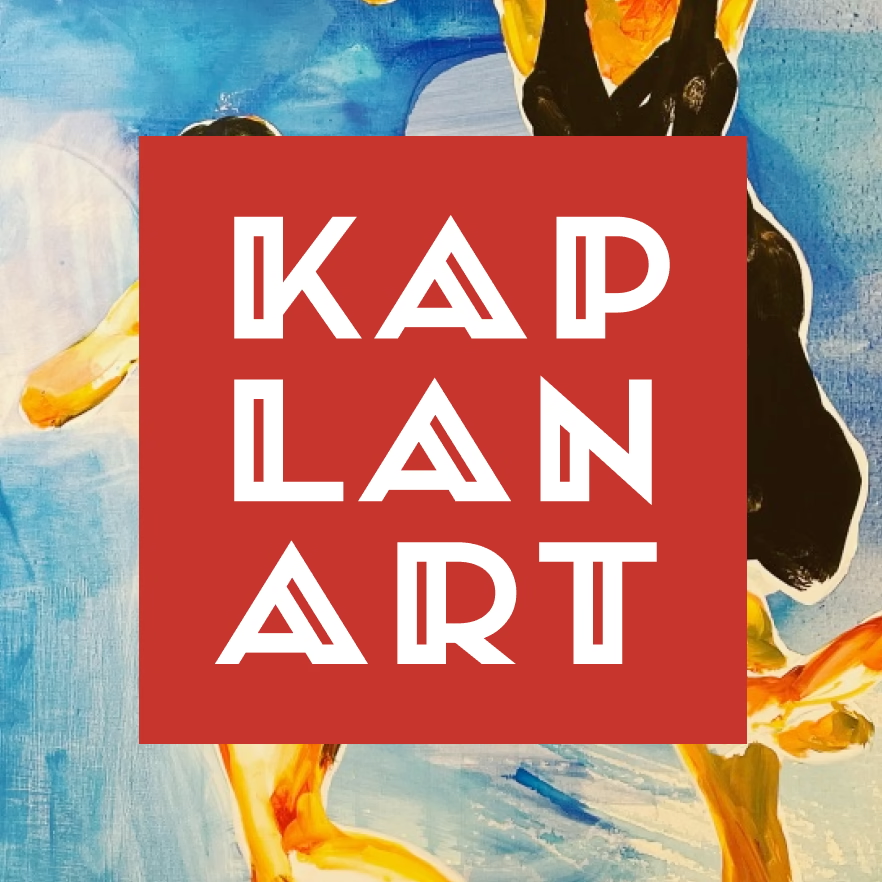
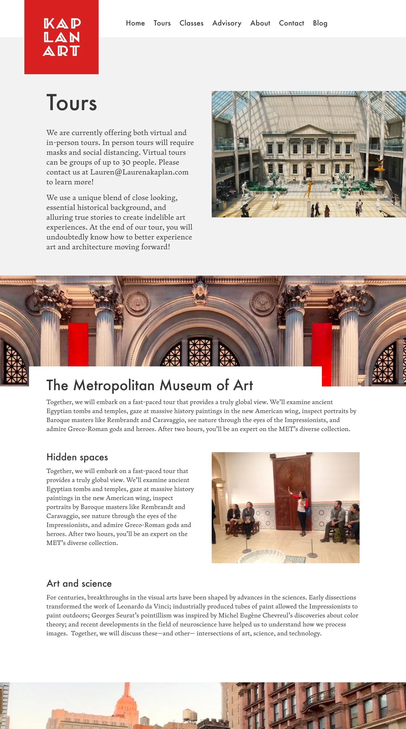
We took art deco themes Lauren gravitates to along with a color scheme common in many galleries and museums around the city to anchor her brand voice. This created a cohesive aesthetic that is authentic to and representative of the work she does.
This brand consisted of Zenith by DJR, typeset into a square logo. The logo paired with Futura for headlines and Fern, again by DJR, for text. The result is an aesthetic that’s bold yet sophisticated. Large impactful images were used throughout, with cutaways to both give the design structure and lead people to further consume content on the pages.
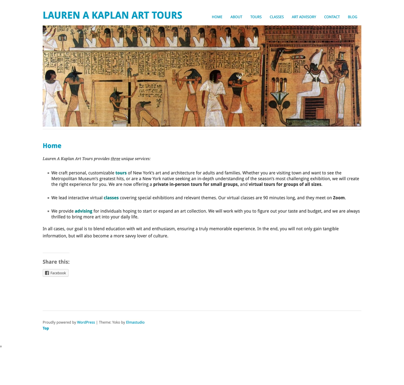
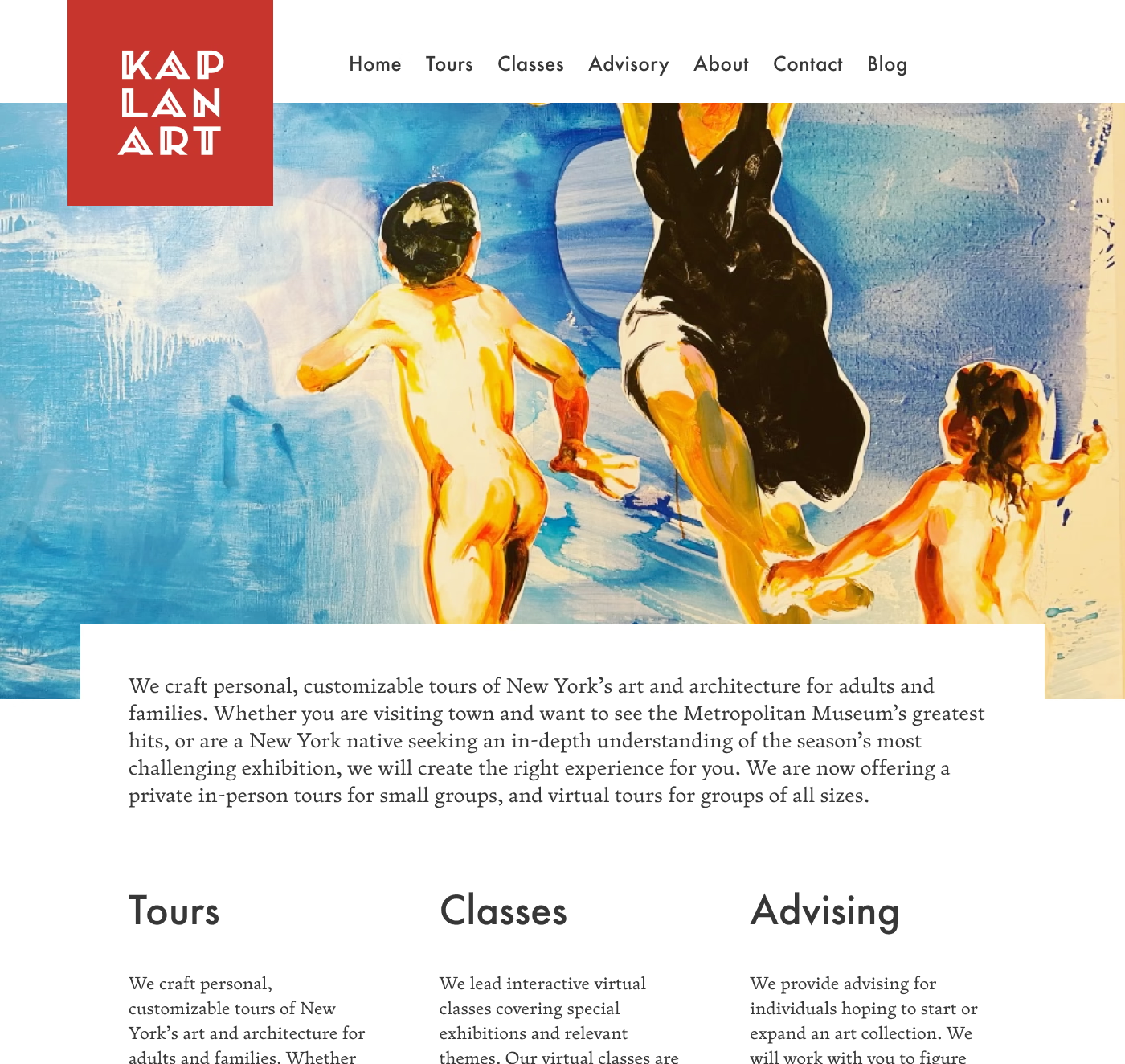
We revised the content architecture and copy on her website to facilitate her connection with her clients. This ensured the content was appropriate and accessible for each section. The Tours page in particular needed to guide people through the vast expanse of art, architecture, and galleries of New York City.
The blog was an area of focus as well. Moving content on the home page to separate posts and pages and ensuring updates are surfaced throughout.
Code
To implement the changes while retaining Lauren’s workflow we developed a custom WordPress theme, then implemented it on a staging site to ensure all plugins worked appropriately. We also managed the migration and redirects of URLs for better SEO. After ensuring everything was perfect on staging, we migrated to the main website. The result was no website downtime. Client bookings never missed a beat.
Magic
We created a brand and digital presence that brings Lauren and her clients closer together. The Lauren A. Kaplan Tours vision shines in this dynamic yet balanced branding work, and we’re wildly proud to be a building block in this New York institution.
Website or brand feeling a little stale?
We get it! We can help you with a variety of projects from large branding exercises and website builds to quick fixes and design refreshes. We’ve worked with individuals, editorial clients, government agencies, type foundries, and educational institutions. We’d love to work with you too.
