2x page views
3x time on site
15% lower bounce rate
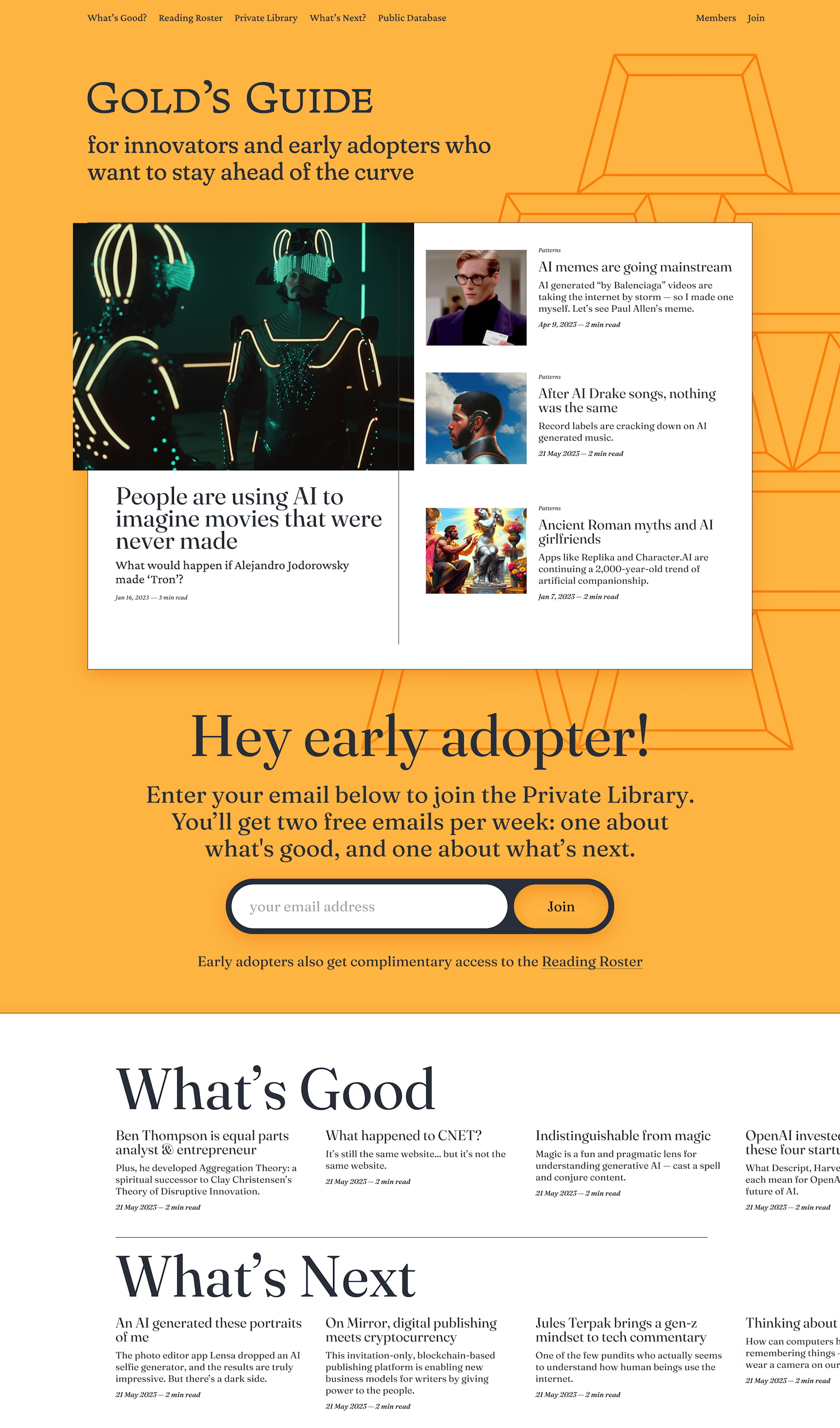
We partnered with Tyler Gold to create a website showcasing his coverage of tech, culture, and personalities. His writing is thorough with deep and thoughtful insights and we worked to elevate the design to better align with his goals. The website is built on top of Ghost, an outstanding CMS for bloggers, publications, and newsletters. We iterated quickly to deliver a complete rebrand and website within two months.


Our goal was to create a website that would better retain readers of their long-form articles. To do this we needed two things: a recognizable brand people would know to come back along with compelling yet readable article pages that would better capture and retain a reader’s attention.
For the brand we chose a vibrant gold color and liberally used it across the background, making the whole website pop at a glance. The logo used a classical serif, Fern by DJR, to create a unique richness and character. The result was something that feels fresh and interesting while retaining authority.
Increasing email signups was another goal of this project, and we created a dedicated email signup area of the home page with a sticky signup notice. We wanted to create something intentional and native feeling while also being ever-present.
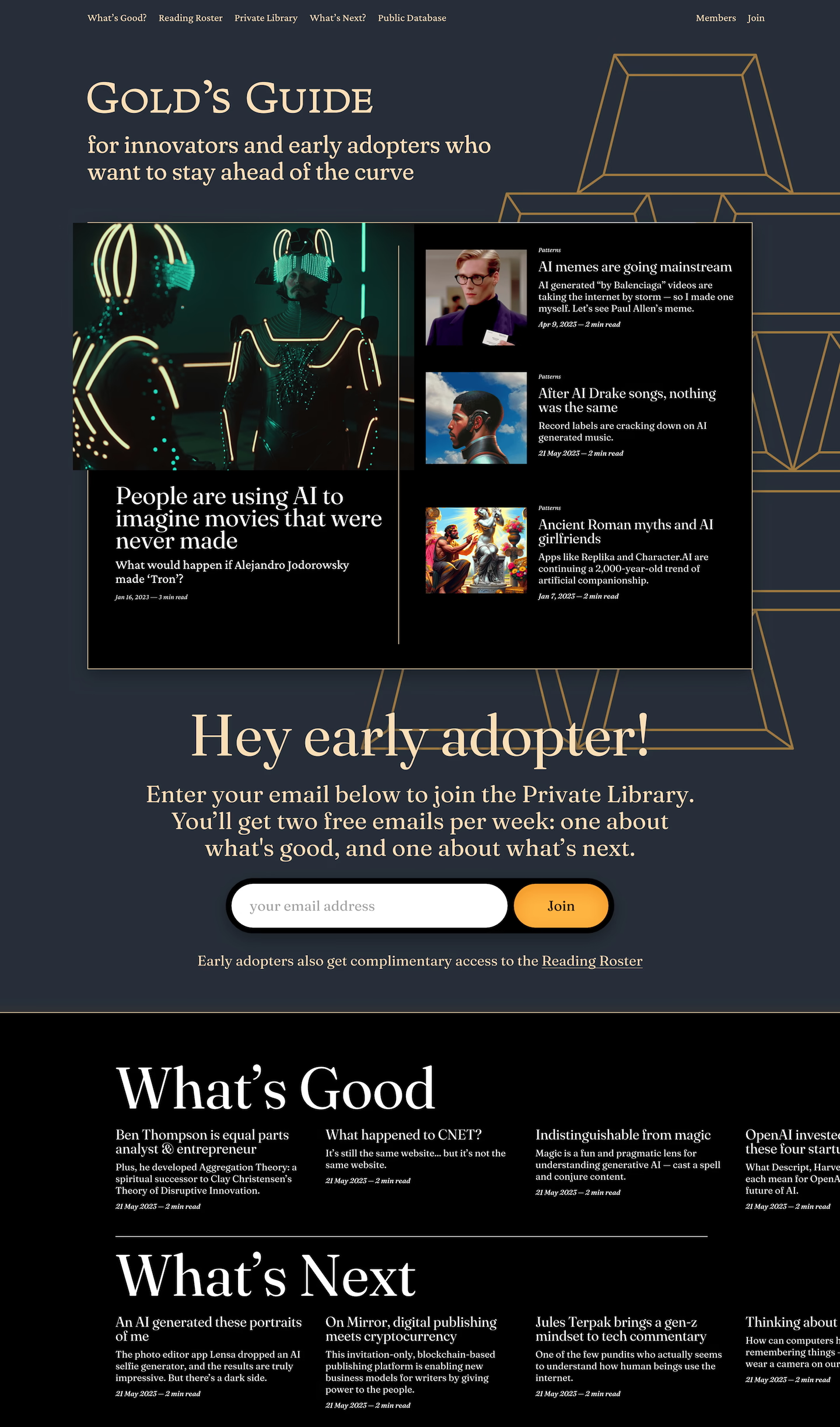
The article page was focused on ergonomics. People came to read and Gold’s Guide had relatively long articles. For these pages we stick with a straightforward black text on a white background, or a dark mode with white text on a black background. Frances is the typeface we used for text, adding character to the page while retaining great readability.
After the redesign of Gold’s Guide, they saw a 2x uptick in page views and reduction in bounce rates of 10%. Readers were spending 3x more time on the site increasing engagement.
Website or brand feeling a little stale?
We get it! We can help you with a variety of projects from large branding exercises and website builds to quick fixes and design refreshes. We’ve worked with individuals, editorial clients, government agencies, type foundries, and educational institutions. We’d love to work with you too.

